Introduction
For Shopify store owners selling products with replaceable parts, an interactive parts diagram can transform the customer experience. Konfigr, a powerful Shopify app, allows you to turn complex exploded views and schematics into shoppable experiences, helping customers quickly identify and purchase the exact components they need. A key decision when setting up your Konfigr viewer is choosing the right layout: stacked or side-by-side.
The layout you select directly impacts how easily your customers can interact with the diagram and find parts. It affects everything from visual flow to mobile responsiveness and overall user satisfaction. This article will delve into the nuances of stacked and side-by-side layouts for your Shopify parts diagram theme, providing pros, cons, use cases, and practical advice to help you make an informed decision for your storefront.
Understanding Shopify Parts Diagrams with Konfigr
Before diving into layout specifics, let's briefly define what a "konfig" (Konfigr's term for an interactive parts diagram) entails. A konfig is an interactive viewer embedded directly onto a Shopify product page. It features a diagram image (like an exploded view or schematic) with numbered, clickable hotspots. Each hotspot links to one or more existing Shopify products, allowing customers to click a part in the diagram and instantly see its details, live price, and stock status, then add it to their cart.
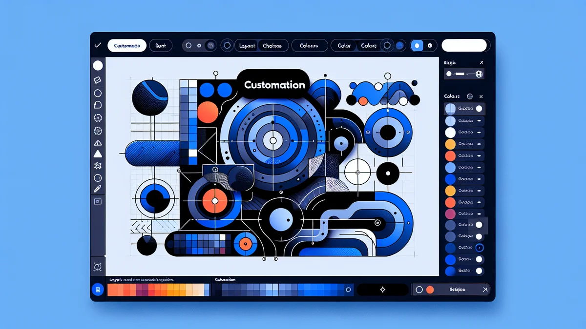
Konfigr integrates seamlessly with your Shopify store as an app block, meaning you can add parts diagrams to any Shopify theme without needing to write any code. This flexibility extends to display customisation, including the choice between stacked and side-by-side layouts, which can be configured directly within the Shopify theme editor for each specific konfig.
Stacked Layout: Diagram Above, Parts List Below
The stacked layout arranges your parts diagram image above its corresponding list of items and their details. This means customers typically view the full diagram first, then scroll down to see the numbered list of components and their linked products. When a hotspot on the diagram is clicked, the corresponding item in the list below is highlighted, and the page might scroll to bring it into view.
Pros of the Stacked Layout
- Mobile-First Design: This layout naturally adapts well to smaller screens. On mobile devices, a single-column flow is intuitive, preventing horizontal scrolling and ensuring a smooth user experience.
- Clear Visual Hierarchy: The diagram takes centre stage, allowing customers to absorb the overall product structure before diving into individual components. This can be beneficial for initial understanding.
- Less Horizontal Space Required: Since the diagram and list don't compete for width, this layout is more forgiving on narrower product pages or when other elements (like product descriptions or images) need to share the available horizontal space.
- Simplicity: For users accustomed to traditional web layouts, a stacked arrangement often feels familiar and easy to navigate.
Cons of the Stacked Layout
- Increased Vertical Scrolling on Desktop: On larger screens, users may need to scroll significantly to view the entire parts list, especially for diagrams with many components. This can break the visual connection between the diagram and the list.
- Less Immediate Context on Desktop: While the diagram is prominent, the direct, simultaneous view of a part on the diagram and its details in the list is lost. Users might have to scroll back and forth to cross-reference.
- Potentially Longer Pages: If your diagram is tall and your parts list is extensive, the combined content can make for a very long product page, potentially pushing other important product information further down.
Ideal Use Cases for the Stacked Layout
- Complex Diagrams with Many Parts: When your diagram is very detailed and has 50+ items, a stacked layout allows the list to extend vertically without squishing the diagram.
- Mobile-Heavy Audiences: If your analytics show that a significant portion of your customers browse on smartphones or tablets, the stacked layout offers a superior mobile experience.
- Limited Horizontal Space: For Shopify themes where the main content area is relatively narrow, or where you have a lot of other essential product information (text, images, videos) that needs to be displayed prominently alongside the parts diagram.
- When Full Diagram View is Paramount: If you want customers to focus on understanding the entire diagram before looking at individual parts, this layout emphasises the whole.
Practical Example
Imagine a Shopify store selling replacement parts for a complex industrial machine. The konfig for the machine's main assembly has an exploded diagram with 80+ unique parts. For a technician on a tablet or a customer quickly browsing on their phone, the stacked layout ensures the diagram is fully visible without zooming issues, and the comprehensive parts list can be scrolled through easily below it. The priority here is clear viewing of both elements, even if it requires more vertical travel.
Side-by-Side Layout: Diagram Next to Parts List
The side-by-side layout positions your parts diagram image and its corresponding list of items adjacent to each other. This means both the visual representation and the detailed list are simultaneously visible, often in a two-column format. When a hotspot is clicked on the diagram, the linked item is highlighted in the adjacent list, providing immediate context.
Konfigr allows you to configure the column ratio for the side-by-side layout, giving you control over how much width each section occupies (e.g., 60/40, 50/50). On smaller screens like mobile phones, this layout typically collapses to a stacked view automatically to maintain usability.
Pros of the Side-by-Side Layout
- Immediate Visual Connection: This is the strongest advantage. Customers can see the part on the diagram and its details in the list simultaneously, reducing the need to scroll or mentally bridge a gap.
- Optimised for Desktop Viewing: On larger screens, where horizontal space is abundant, the side-by-side layout utilises the screen real estate efficiently, providing a comprehensive view.
- Efficient Cross-Referencing: Ideal for users who frequently jump between the diagram and the list to compare or identify multiple components quickly. This is particularly useful for technicians or experienced buyers.
- Configurable Column Ratio: Konfigr's ability to adjust the width balance between the diagram and the list (e.g., 70% diagram, 30% list) allows you to prioritise visual space based on your specific diagram and content.
- Reduced Vertical Scrolling on Desktop: For many diagrams, the side-by-side layout can significantly shorten the overall page length compared to a stacked view, keeping more content "above the fold."
Cons of the Side-by-Side Layout
- Less Mobile-Friendly (Requires Collapse): While Konfigr handles the collapse to stacked on mobile, the primary side-by-side experience is not designed for small screens. If your audience is predominantly mobile, the benefits of this layout might be less felt.
- Requires Sufficient Horizontal Space: For the layout to be effective without feeling cramped, the product page needs enough width. If your Shopify theme has a very narrow main content area, a side-by-side layout might force elements to shrink too much.
- Potential for Visual Clutter: If both the diagram and the list are very dense, placing them side-by-side without enough padding or clear separation can make the interface feel overwhelming.
- May Push Other Content Down: Depending on the height of your diagram and list, this layout could still push other product page elements further down the page, especially if it occupies a significant vertical space.
Ideal Use Cases for the Side-by-Side Layout
- Simple to Moderately Complex Diagrams: Best for diagrams where the list isn't excessively long (e.g., 10-30 parts), allowing both elements to fit comfortably side-by-side without excessive scrolling.
- Desktop-Heavy Audiences: Perfect for B2B stores, industrial suppliers, or professional parts dealers where customers (often technicians or procurement managers) primarily use desktop computers.
- When Direct Comparison is Crucial: If customers frequently need to identify a part visually and immediately see its price, stock, and SKU without interruption.
- Diagrams with Balanced Dimensions: When your diagram image isn't excessively tall, allowing it to sit comfortably next to the parts list without one element being disproportionately long.
Practical Example
Consider a Shopify store selling pool and spa parts. A konfig for a popular pool pump might have an exploded diagram with 15-20 key components. A service technician, often using a laptop at a job site, needs to quickly identify a worn o-ring on the diagram and see its exact part number and price in the adjacent list. The side-by-side layout, perhaps with a 60/40 ratio favouring the diagram, provides this immediate, efficient access to information, reducing time spent searching.
Factors to Consider When Choosing Your Layout
Making the right layout choice involves evaluating several key factors specific to your products, audience, and Shopify theme.
Diagram Complexity and Number of Parts
- High Complexity/Many Parts: A very detailed diagram with a long list of 50+ items might benefit from a stacked layout, preventing the side-by-side view from becoming too cramped or requiring excessive vertical scrolling within a single column.
- Low to Moderate Complexity/Fewer Parts: Diagrams with fewer parts (e.g., 5-30 items) are excellent candidates for a side-by-side layout, allowing for efficient use of screen space without overwhelming the user.
Audience Device Usage
- Predominantly Mobile: If a majority of your customers access your store via smartphones, a stacked layout offers a naturally optimised experience. While Konfigr's side-by-side layout collapses gracefully, starting with a stacked approach might align better with native mobile user patterns.
- Predominantly Desktop/B2B: For audiences who primarily use desktop computers or large tablets (e.g., professional technicians, industrial buyers), the side-by-side layout maximises efficiency and information density.
Shopify Product Page Real Estate
- Narrow Content Area: Some Shopify themes have a relatively narrow main content column. In such cases, a stacked layout might be the only practical option to ensure both the diagram and list are legible.
-
Related Articles
Continue your learning with these related resources:
- How to Create Interactive Parts Diagrams on Shopify: The Complete Guide (Comprehensive Guide)
- Mastering Shared Components Across Multiple Shopify Parts Diagrams for E-commerce Efficiency
- How Shopify Parts Diagram Cart Integration Works on Your Theme
- Tips for Creating Clear, Professional Parts Diagrams for Your Shopify Store
- Customising Your Shopify Parts Diagram: Layout, Colours, and Typography
- How a Shopify Parts Diagram Works for Customers (A Storefront Walkthrough)