Introduction
For Shopify store owners selling products with replaceable components, an interactive parts diagram is invaluable. It transforms a complex catalogue into a visual, intuitive shopping experience, helping customers quickly identify and purchase the exact parts they need. However, merely having a parts diagram isn't enough; its presentation must align with your brand and provide an optimal user experience.
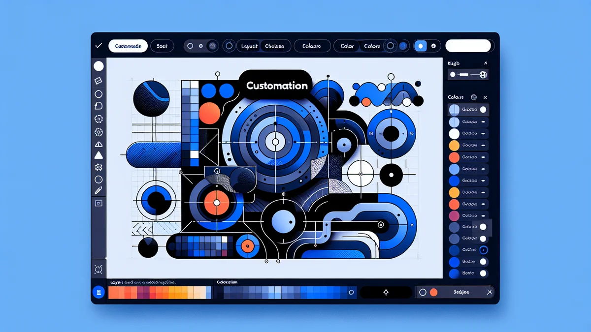
This is where customisation comes in. With Konfigr, the Shopify app designed to create these interactive viewers, you have extensive control over how your parts diagram appears on your storefront. From adjusting the layout to matching your brand's colours and ensuring clear typography, customising your Konfigr viewer allows you to create a cohesive and professional look that enhances customer trust and reduces "which part do I need?" inquiries. Let's dive into how you can tailor your Shopify parts diagram theme to perfection.
Understanding Konfigr's Customisation Options
Konfigr integrates seamlessly into your Shopify store as an app block. This means that all primary customisation for the viewer's appearance – its layout, colours, and typography – is managed directly within your Shopify theme editor. This approach ensures that you don't need any coding knowledge to make significant visual changes, making it accessible for all Shopify store owners.
The app block structure allows for easy placement and configuration. Once you add parts diagram Shopify theme elements using Konfigr, you gain direct access to its settings within the familiar Shopify environment. This method also guarantees compatibility with virtually any Shopify theme, including popular choices like the Dawn theme, ensuring your interactive parts diagrams look great regardless of your store's design.
Step-by-Step Guide to Customising Your Konfig Viewer
Customising your Konfigr viewer is a straightforward process performed within your Shopify theme editor. Follow these steps to tailor the appearance of your Shopify app block parts diagram to match your brand's aesthetic and enhance user experience.
Accessing the Theme Editor
- Log in to your Shopify Admin: From your dashboard, navigate to "Online Store" and then "Themes."
- Open the Theme Customiser: Find the theme you wish to edit (it's best to work on a duplicate theme first if making extensive changes). Click the "Customize" button next to your theme's name.
- Select a Product Page with a Konfig: In the theme editor preview, use the dropdown at the top of the page to navigate to "Products" and select a product that has a Konfigr viewer installed. This will load the product page and display your interactive parts diagram, allowing you to see your changes in real-time.
Locating the Konfigr App Block
Once you are on a product page displaying a Konfigr viewer, you need to find its settings in the theme editor sidebar.
- Identify the "Product Information" Section: In the left sidebar of the theme editor, scroll down until you find the "Product information" section. This is where most product-related content blocks reside.
- Locate the Konfigr Viewer Block: Within the "Product information" section, you will see a block titled "Konfigr Viewer." Click on this block to reveal its specific customisation settings. These settings will allow you to control the appearance of your parts diagram.
Adjusting Layout and Structure
The layout of your Konfigr viewer determines how the diagram image and the parts list are displayed relative to each other. Konfigr offers flexible options to ensure your customers can easily navigate your parts catalogue.
- Choose Your Display Layout:
- Stacked Layout: The diagram image appears above the parts list. This is often preferred for mobile devices or when the diagram needs to occupy the full width.
- Side-by-Side Layout: The diagram image and the parts list appear next to each other. This is ideal for desktop viewing, allowing customers to see both elements simultaneously.
- Set Desktop Column Ratio (for Side-by-Side): If you select the Side-by-Side layout, you can further refine its appearance by setting the desktop column ratio. This controls the relative width of the diagram versus the parts list. For example:
- 50/50: Equal width for both.
- 60/40: Diagram takes 60% width, parts list takes 40%. This is great for complex diagrams.
- 70/30: Diagram takes 70% width, parts list takes 30%. Useful when the diagram is the primary focus.
Practical Tip: A pool and spa supplier might use a 60/40 ratio to give ample space to an intricate pump diagram while still keeping the parts list clearly visible.
- Configure Display Elements: Konfigr allows you to show or hide specific information within the viewer, providing a cleaner interface if desired.
- Show/Hide Stock Status: Decide if you want customers to see real-time stock availability directly in the parts list.
- Show/Hide SKU: Toggle the visibility of product SKUs.
- Enable/Disable Zoom and Pan: Control whether customers can zoom in on the diagram image and pan around it. For very detailed diagrams, enabling this is highly recommended.
Harmonising Colours with Your Brand
Matching the Konfigr viewer's colours to your store's existing palette creates a seamless and professional look, reinforcing your brand identity.
- Adjust Viewer Colours: Konfigr provides colour pickers for various elements within the viewer. Use these to align with your brand's aesthetics:
- Hotspot Marker Colour: The colour of the numbered markers on your diagram.
- Active Item Highlight Colour: The colour that highlights a part in the list and its corresponding hotspot when selected.
- Text Colour: The colour of the text in the parts list (part names, prices, etc.).
- Background Colour: The background colour of the parts list section.
Practical Tip: An automotive parts retailer might use their brand's primary accent colour for active hotspot highlights, making it easy for customers to identify selected parts instantly.
Refining Typography for Readability
Clear and legible typography is crucial for helping customers read part numbers, descriptions, and prices without effort, especially for detailed parts lists.
- Select Font Families: Konfigr can typically inherit your theme's default fonts, ensuring consistency across your store. However, you can often specify different fonts for the viewer if your theme allows, or if Konfigr provides specific options within its app block settings.
- Adjust Font Sizes: Fine-tune the font sizes for different textual elements within the parts list, such as:
- Marker labels on the diagram.
- Item titles (part names).
- Prices and stock information.
Ensure that the text is easily readable on both desktop and mobile devices. A machinery parts distributor, for instance, would want part numbers to be unmistakably clear to prevent ordering errors.
Advanced Customisation with Custom CSS (Optional)
For store owners with some CSS knowledge, Konfigr offers an advanced customisation option to achieve truly unique styling that might not be available through the standard theme editor settings.
- Utilise Custom CSS: Within the Konfigr app block settings in the theme editor, there is typically a field for "Custom CSS." Here, you can input your own CSS rules to override default styles. This allows for precise control over margins, padding, borders, specific element colours, and more.
Note: This step requires familiarity with CSS. If you're not comfortable with coding, stick to the visual settings provided, which are usually sufficient for most branding needs.
Best Practices for an Effective Parts Diagram
Beyond the technical steps of customisation, consider these best practices to ensure your Konfigr viewer delivers the best possible experience:
- Brand Consistency: Always strive to match the viewer's design with your overall Shopify parts diagram theme. Consistent branding builds trust and makes your store feel professional.
- Prioritise Clarity: The primary goal of a parts diagram is to help customers identify parts quickly. Ensure your diagram images are high-resolution, hotspots are clearly visible, and text is legible.
- Mobile Responsiveness: Always test your Konfigr viewer on different devices, especially mobile phones and tablets. The layout and text should remain clear and functional regardless of screen size. Konfigr is built with responsiveness in mind, but it's always good to double-check your specific setup.
- User-Friendly Hotspots: Position your hotspots precisely on the diagram so they intuitively point to the correct part. Ensure the marker numbers are easy to associate with the corresponding items in the parts list.
Integrating Konfigr with Your Shopify Theme
Konfigr's strength lies in its seamless integration. When you set up Konfigr, the onboarding checklist guides you through adding the Shopify app block parts to your chosen product template. For popular themes like Dawn, the process to get a Dawn theme parts diagram up and running is incredibly intuitive.
The app automatically handles many technical aspects of the Shopify Konfig viewer setup. Once the app block is placed on your product page template (usually a custom template like `product.konfig.json`), it dynamically loads the interactive diagram. This means you only have to focus on the visual customisation, knowing the underlying functionality is robust and fully integrated with your Shopify products, including live pricing and stock information.
Related Articles
Continue your learning with these related resources:
- How to Create Interactive Parts Diagrams on Shopify: The Complete Guide (Comprehensive Guide)
- How Shopify Parts Diagram Cart Integration Works on Your Theme
- Tips for Creating Clear, Professional Parts Diagrams for Your Shopify Store
- How a Shopify Parts Diagram Works for Customers (A Storefront Walkthrough)
- What Is a Shopify Parts Diagram? (And How It Turns Browsers Into Buyers)
- How to Create Your First Interactive Parts Diagram on Shopify
Conclusion
Customising your Shopify parts diagram is more than just aesthetics; it's about enhancing the customer journey and strengthening your brand. By taking the time to adjust the layout, harmonise colours, and refine typography of your Konfigr viewer, you create a professional, easy-to-use interface that helps customers find exactly what they need.
Konfigr provides the tools to achieve this without requiring complex coding, allowing you to focus on selling parts with confidence. A well-designed, interactive parts diagram not only reduces support inquiries but also significantly improves customer satisfaction and boosts sales by making your complex parts catalogue instantly shoppable. Start customising your Konfigr viewer today and transform your parts selling experience.