Introduction
For Shopify store owners selling products with replaceable components, helping customers find the right part can be a significant challenge. Traditional text-based lists often lead to confusion, incorrect orders, and an influx of support calls asking, "Which part do I need?" An interactive parts diagram transforms this experience, allowing customers to visually identify and purchase components directly from an exploded view or schematic.
Konfigr is a powerful Shopify app designed to make your parts catalogue visual and shoppable. It enables you to create interactive diagrams, place clickable hotspots on individual components, and link them directly to your existing Shopify products. This article will guide you through the process of adding the Konfigr interactive parts diagram viewer to any Shopify theme, focussing on the simple installation using theme app blocks and how to customise its display for your store.
Understanding Shopify Theme App Blocks
Shopify theme app blocks are modular components that allow apps to integrate seamlessly into your store's theme without requiring manual code edits. They provide a user-friendly way to add app functionality directly through the Shopify theme editor, giving merchants full control over where and how app features appear on their product pages.
This approach simplifies the installation of tools like the Konfigr viewer. Instead of hiring a developer or manually editing theme files, you can drag and drop the Konfigr app block into your desired product template. This makes it a flexible and future-proof solution, as app blocks are designed to work across various themes, including newer Online Store 2.0 themes like Dawn.
Step-by-Step Guide: Adding the Konfigr Viewer to Your Shopify Theme
Prerequisite: Install the Konfigr App
Before you can add an interactive parts diagram to your Shopify theme, you need to install the Konfigr app from the Shopify App Store. Once installed, Konfigr provides a streamlined interface within your Shopify admin to manage your diagrams, hotspots, and product links. The app offers a free plan for up to 5 konfigs, allowing you to test its capabilities without initial investment.
Step 1: Create Your First Konfig
A "konfig" is Konfigr's term for an interactive parts diagram linked to a parent Shopify product. This parent product is where your diagram viewer will appear. If you haven't already, create a konfig within the Konfigr app:
- Upload Your Diagram Image: Start by uploading an exploded view, assembly diagram, or schematic. Konfigr handles the image hosting.
- Place Hotspot Markers: Use the drag-and-drop interface to place numbered "hotspot" markers on each component position in your diagram.
- Link to Shopify Products: For each marker (or "item"), link one or more existing Shopify products. You can offer multiple options for a single position (e.g., "OEM Original" or "Aftermarket"). Konfigr automatically unlists these "child products" from search and collections to keep your storefront clean, making them discoverable only through the diagram.
- Publish Your Konfig: Set the konfig to "Published" within the Konfigr app. This makes it available for display on your storefront. Konfigr also automatically sets the parent product's price to $0 to prevent accidental direct purchases, ensuring all sales go through the interactive diagram.
Step 2: Navigate to Your Shopify Theme Editor
With your konfig ready, the next step is to integrate it into your theme. From your Shopify admin:
- Go to Online Store > Themes.
- Find your current theme and click Customise. This opens the Shopify theme editor.
Step 3: Locate the Product Template
The Konfigr viewer is designed to appear on individual product pages. You need to add the app block to the product template associated with your parent product:
- In the theme editor, use the dropdown menu at the top centre (it usually says "Home page") and select Products > Default product.
- If you have created a custom product template for your konfig products (e.g., a "product.konfig" template suffix), navigate to that specific template instead. This is often a good practise to ensure the diagram only appears on relevant products.
Step 4: Add the Konfigr App Block
Now, you'll add the Konfigr app block to your chosen product template:
- In the left sidebar of the theme editor, scroll down to the "Product information" section or the "Template" section, depending on your theme.
- Look for an Add block button (often a plus icon
+). Click it. - A list of available blocks will appear. Scroll down until you find Apps, then select Konfigr Viewer.
- Once added, the Konfigr Viewer block will appear in your sidebar. You can drag and drop it to reposition it within your product page layout. Common placements include below the product description, above the "Add to cart" button, or in a dedicated section.
- The preview pane on the right will now show the interactive parts diagram for any product that has a published konfig associated with it. If you don't see anything, ensure you're previewing a product that is a "parent product" for a published konfig.
Step 5: Configure the Konfigr App Block Settings
The Konfigr app block comes with various settings directly within the theme editor, allowing you to customise its appearance without any coding:
- Layout Options: Choose between a stacked layout (diagram above the parts list) or a side-by-side layout. For side-by-side, you can often configure the desktop column ratio (e.g., 60/40 or 50/50) to optimise space.
- Visibility Settings: Toggle options to show/hide stock status, enable/disable zoom and pan on the diagram, or show/hide SKU for linked parts.
- Custom CSS: For merchants who need advanced branding control, there's often an option to input custom CSS directly into the app block settings. This allows you to override default styles to match your theme perfectly.
- Padding and Margins: Some themes allow you to adjust spacing around the app block to ensure it blends seamlessly with your existing layout.
Experiment with these settings to find the best look and feel for your store. The real-time preview in the theme editor will show your changes instantly.
Step 6: Preview and Publish Your Changes
Once you are satisfied with the placement and configuration of the Konfigr Viewer app block:
- Preview: Thoroughly test the interactive diagram on a live product page by clicking the "View store" button or navigating to the product page on your live site. Check that hotspots are clickable, products are linked correctly, and the "add to cart" functionality works as expected.
- Save: Click the Save button in the top right corner of the theme editor to apply your changes to your live Shopify store. Your interactive parts diagram is now live for your customers!
Integrating with Specific Shopify Themes (Dawn Example)
While the Konfigr app block works universally across Shopify themes, some themes offer enhanced integration for a truly seamless experience. Konfigr provides specific optimisations for popular themes like Dawn.
Dawn Theme: Seamless Cart Integration
For stores using Shopify's free Dawn theme (and other compatible themes like Horizon and Hyper), Konfigr offers enhanced cart integration. When a customer adds a part to their cart from the interactive diagram, the cart drawer will automatically open, providing immediate feedback and allowing them to proceed to checkout or continue shopping. This creates a very smooth and intuitive buying journey, similar to how standard product additions work on these themes.
Other Themes
For other Shopify themes, the "add to cart" functionality from the Konfigr viewer will still work perfectly, adding the selected part to the customer's cart. The primary difference might be that the cart drawer doesn't automatically open upon adding an item. Customers can still access their cart via your theme's standard cart icon or menu. Konfigr's core functionality—visual identification and direct purchasing—remains fully intact.
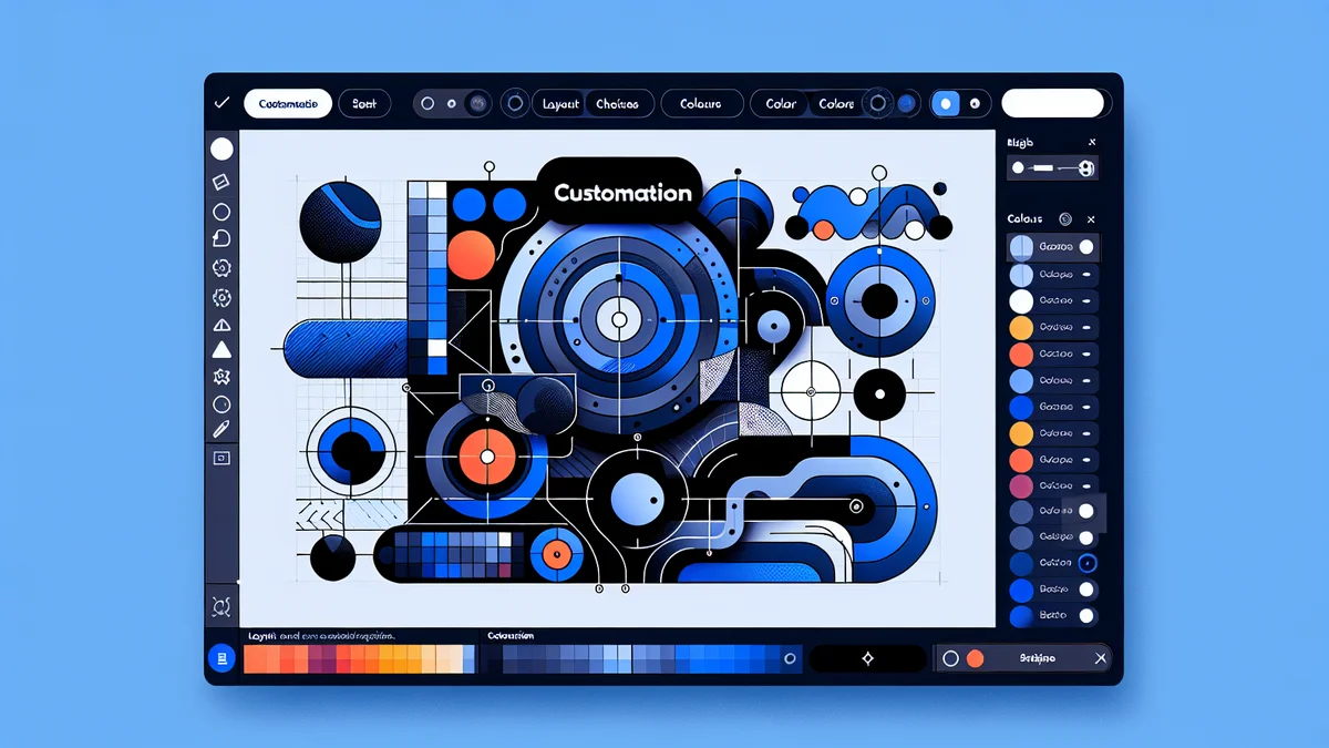
Customising Your Parts Diagram Display
Beyond the basic setup, Konfigr offers several ways to customise how your interactive parts diagrams appear, ensuring they align with your brand and customer experience.
Layout Options
The choice between a stacked and side-by-side layout significantly impacts user experience, especially on different devices. A stacked layout often works well for simpler diagrams or when screen space is limited, ensuring the diagram image is prominent before the parts list. A side-by-side layout is excellent for more complex diagrams, allowing customers to view the image and scroll through the parts list simultaneously. You can usually adjust the column ratio (e.g., 60% diagram, 40% list) for optimal viewing on desktop.
Styling with Custom CSS
For merchants with specific design requirements or those looking to perfectly match their theme's aesthetic, Konfigr allows for custom CSS overrides. This advanced option is available directly within the app block settings in the theme editor. By adding your own CSS rules, you can fine-tune colours, fonts, spacing, and other visual elements of the viewer, ensuring a cohesive brand experience.
Visibility Settings
The app provides granular control over what information is displayed alongside each part in the list. You can choose to:
- Show/Hide Stock Status: Display live inventory levels to inform customers about availability.
- Enable/Disable Zoom and Pan: Give customers the ability to magnify and move around the diagram for closer inspection of intricate details.
- Show/Hide SKU: Display the Stock Keeping Unit for easy reference, particularly useful for technical buyers or service professionals.
These settings allow you to tailor the viewer to your customer's needs, reducing friction and improving clarity.
Best Practises for Konfigr Implementation
To maximise the effectiveness of your interactive parts diagrams and provide the best customer experience, consider these best practises:
- Use High-Quality Diagram Images: Clear, high-resolution images are crucial. Blurry or low-detail diagrams defeat the purpose of visual identification. Ensure your images are well-labelled and easy to understand.
- Accurate Hotspot Placement: Precision in placing hotspot markers directly over the corresponding part in the diagram is vital. Misplaced markers lead to confusion and incorrect orders.
- Descriptive Product Labels: When linking products to a hotspot, use clear and concise labels for each option (e.g., "Impeller (OEM Genuine)", "Impeller (Aftermarket)"). This helps customers differentiate between choices.
- Group Related Parts: For components often replaced together (e.g., a seal kit), consider linking multiple child products to a single hotspot, or clearly indicating suggested pairings in the product descriptions.
- Test Thoroughly: Before publishing your konfig and saving your theme changes, extensively test the entire user flow. Click every hotspot, add items to the cart, and check responsiveness on different devices.
- Maintain Child Product Information: Ensure the Shopify product pages for your child products (the individual parts) have comprehensive descriptions, images, and accurate pricing/stock. While Konfigr makes them discoverable, the product page still provides essential details.
Troubleshooting Common Issues
While Konfigr is designed for ease of use, you might encounter minor issues. Here's how to troubleshoot them:
- Konfigr Block Not Appearing:
- Check Konfig Status: Ensure the konfig is "Published" within the Konfigr app. Draft konfigs are only visible in the theme editor preview.
- Parent Product Link: Verify that the product you are viewing in the theme editor is indeed the "parent product" assigned to your published konfig.
- Template Suffix: If you're using a custom template suffix (e.g.,
product.konfig), make sure the parent product is assigned to this template, and you've added the Konfigr app block to that specific template in the theme editor.
- Product Data Not Displaying (Price, Stock, SKU):
- Linked Products: Double-check that all child products linked to hotspots exist in your Shopify catalogue and are not archived or deleted.
- Live Data: Konfigr pulls live data from Shopify. Ensure the products have current prices, inventory, and SKUs.
- Styling Conflicts:
- If the Konfigr viewer's appearance doesn't quite match your theme, use the custom CSS option within the app block settings in the theme editor to apply specific styles.
- Ensure your theme is up-to-date, as older themes might occasionally have rendering quirks.
Related Articles
Continue your learning with these related resources:
- How to Create Interactive Parts Diagrams on Shopify: The Complete Guide (Comprehensive Guide)
- Mastering Shared Components Across Multiple Shopify Parts Diagrams for E-commerce Efficiency
- How Shopify Parts Diagram Cart Integration Works on Your Theme
- Tips for Creating Clear, Professional Parts Diagrams for Your Shopify Store
- Customising Your Shopify Parts Diagram: Layout, Colours, and Typography
- How a Shopify Parts Diagram Works for Customers (A Storefront Walkthrough)
Conclusion
Adding an interactive parts diagram to your Shopify store using Konfigr is a straightforward process that significantly enhances the customer experience for businesses selling components and spare parts. By leveraging Shopify's theme app blocks, you can integrate this powerful visual shopping tool into any theme with no coding required. This not only streamlines the parts identification process but also drastically reduces support inquiries and helps ensure customers purchase the correct items, ultimately leading to higher satisfaction and fewer returns. Embrace the visual power of Konfigr to make your complex parts catalogue intuitive and instantly shoppable.