Introduction
For Shopify stores dealing in products with replaceable components – from automotive parts and machinery to pool equipment – helping customers identify and purchase the correct spare parts is a persistent challenge. Traditional methods often involve cumbersome PDFs, endless lists, or frustrating phone calls. This is where an interactive parts diagram integration becomes invaluable, providing a visual, intuitive shopping experience.
Konfigr, a Shopify app, transforms static diagrams into dynamic, shoppable interfaces directly on your product pages. It allows customers to click on a part in an exploded view or schematic, instantly see the linked Shopify product with live pricing and stock, and add it directly to their cart. For Shopify developers and store owners, understanding how this integration works on a theme level is crucial for optimal setup and performance.
The Challenge of Parts Identification in E-commerce
Selling spare parts online often presents unique hurdles. Customers frequently struggle with identifying the exact component they need, leading to incorrect orders, higher return rates, and increased support inquiries. A textual product catalog, no matter how detailed, often lacks the visual context required for precise identification.
This problem is particularly acute for products with many similar-looking components or for customers who are not technical experts. The challenge of identifying the correct part consumes valuable support time and can erode customer confidence if the purchasing process is difficult. An effective parts diagram solution must address these pain points directly within the familiar Shopify ecosystem.
Introducing Konfigr: Interactive Parts Diagrams for Shopify
Konfigr addresses these challenges by enabling merchants to create "konfigs" – interactive parts diagram pages linked to a parent Shopify product. Merchants upload a diagram image, place numbered hotspot markers on each item's position, and link these markers to existing Shopify products in their catalog. This turns a static image into a dynamic sales tool.
The app ensures that all product data displayed – price, stock status, SKU – is live and pulled directly from Shopify, eliminating data synchronization issues. Furthermore, child products linked within a konfig are automatically unlisted from general search, collections, and recommendations, keeping your storefront clean while making the full parts catalog accessible through the diagram interface.
Seamless Shopify Theme Integration with App Blocks
One of Konfigr's core strengths lies in its seamless integration with any Shopify theme, primarily through the use of Shopify app blocks. For developers, this means a straightforward setup process that requires no direct theme code modifications, aligning with modern Shopify development practices.
The App Block Approach
Konfigr deploys its interactive viewer as an app block. This is Shopify's recommended method for app integrations, offering a low-code or no-code solution for merchants. Developers can appreciate this approach for several reasons:
- No Manual Code Editing: Merchants simply add the Konfigr app block to their product page template using the intuitive Shopify theme editor. This minimizes the risk of breaking theme code.
- Theme Compatibility: App blocks are designed to work across all Online Store 2.0 themes (e.g., Dawn, Refresh, Sense). This ensures broad compatibility without requiring specific theme-by-theme adjustments.
- Live Preview: Changes made in the theme editor, including the placement and visibility of the Konfigr app block, are immediately reflected in the live preview, facilitating rapid iteration and deployment.
Implementing the Konfigr Viewer via Product Templates
While the app block provides a visual interface, a crucial element for developers is how Konfigr ensures the viewer appears only on the correct product pages. This is managed through a specific product template suffix, typically named product.konfig.json.
When you create a konfig in the Konfigr app, it automatically assigns a specific product template (e.g., "konfig") to the designated parent product. This template is designed to host the Konfigr app block. Developers should understand that:
- Dedicated Template: The Konfigr app block is intended to be placed within this specialized product template. While you could place it elsewhere, using the dedicated template ensures the konfig viewer is displayed consistently and correctly on pages where it's relevant.
- Theme Editor Configuration: Within the Shopify theme editor, navigate to the
product.konfigtemplate (or similar, depending on the app's exact naming convention). Here, you can add and position the Konfigr app block just like any other section or block. - Contextual Rendering: The app block smartly detects the current product and renders the corresponding interactive diagram if a konfig is associated with that product. If no konfig exists or is a draft konfig, the block will simply not display its content, maintaining a clean UI.
Deep Dive into Cart Integration
A seamless add-to-cart experience is paramount for any e-commerce application. Konfigr offers robust cart integration, allowing customers to add identified parts directly from the diagram viewer. The behaviour of this integration can vary slightly depending on the specific Shopify theme in use, particularly regarding the cart drawer.
Universal Add-to-Cart Functionality
- Direct Product Linking: Each hotspot in a konfig links to an existing Shopify product. When a customer clicks "Add to Cart" for a specific item, Konfigr uses Shopify's standard Cart API to add that product to the customer's cart.
- Quantity Selection: Customers can select the desired quantity for each part before adding it to the cart, just as they would on a standard product page.
- Live Data: The app ensures that the item added to the cart reflects the current price, stock, and any variant information directly from Shopify, preventing discrepancies.
Enhanced Cart Drawer Integration (Dawn, Horizon, Hyper)
For themes built on Shopify's modern architecture and known for their sophisticated cart drawer implementations, Konfigr offers an enhanced integration. This includes official Shopify themes like Dawn, Horizon, and Hyper. On these themes, when a customer adds a part to their cart from the Konfigr viewer:
- Seamless Drawer Activation: The theme's cart drawer will automatically open or slide out, displaying the newly added item along with existing cart contents. This provides instant visual feedback and a smooth, uninterrupted shopping flow.
- No Page Refresh: The user remains on the product page with the interactive diagram, allowing them to continue exploring other parts without disruption. This is crucial for a positive user experience, especially when customers are building a list of multiple parts.
What to Expect on Other Themes
While Konfigr provides full add-to-cart functionality across all Shopify themes, the automatic opening of the cart drawer is specifically optimized for Dawn, Horizon, and Hyper. For other themes:
- Functional Add-to-Cart: Clicking "Add to Cart" will still successfully add the product to the customer's cart. The product will be there when they navigate to the cart page or checkout.
- Potential Page Refresh: Depending on how your theme handles its add-to-cart actions, the page might refresh, or the customer may need to manually navigate to the cart page to see the updated contents. While fully functional, this might introduce a slight interruption compared to the drawer experience.
- Custom Development Opportunity: For developers working with custom themes or themes that don't auto-open the cart drawer, there's an opportunity to implement custom JavaScript to trigger the theme's cart drawer or a similar notification when Konfigr's add-to-cart event occurs. Konfigr uses standard Shopify API calls, making it compatible with custom event listeners.
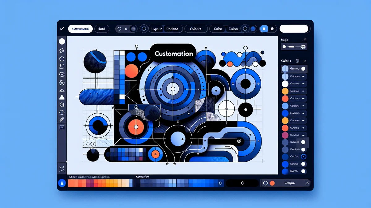
Customizing the Konfigr Viewer on Your Theme
Beyond basic placement, Konfigr offers extensive customization options directly within the Shopify theme editor, allowing you to tailor the viewer's appearance to match your brand and specific theme aesthetic. This ensures the shopify konfig viewer setup is consistent with your store's design.
Theme Editor Settings
When you add the Konfigr app block to your `product.konfig` template, you'll find various settings available in the theme editor's sidebar:
- Layout Options: Choose between a stacked layout (diagram above parts list) or a side-by-side layout. For the side-by-side option, you can typically configure the desktop column ratio (e.g., 60/40, 50/50) to optimize space utilization.
- Display Controls: Toggle the visibility of elements like stock status, SKU, and enable/disable features such as diagram zoom and pan. This allows for a clean interface, showing only the most relevant information.
- Colour & Typography: Adjust colours for hotspots, text, and other elements to align with your theme's palette. Some basic typography controls might also be available.
Leveraging Custom CSS for Advanced Styling
For developers and designers who require more granular control or need to implement highly specific brand styling, Konfigr provides a dedicated field for custom CSS overrides. This is a powerful feature:
- Targeted Styling: You can write custom CSS rules to override default Konfigr styles. This is ideal for adjusting padding, margins, font sizes, button styles, or specific element alignments that aren't covered by the theme editor settings.
- Developer Flexibility: This feature empowers developers to ensure the Konfigr viewer integrates flawlessly, down to the pixel, with even the most bespoke Shopify themes. By inspecting the Konfigr viewer's HTML structure, you can identify specific classes and IDs to target your CSS rules.
Developer Considerations and Best Practices
For Shopify developers integrating Konfigr, understanding the underlying mechanisms and following best practices can optimize performance and maintainability.
Understanding Metafields and Data Storage
Konfigr stores all konfig data – diagram image URL, hotspot coordinates, linked product IDs, marker labels – directly within Shopify product metafields. This is a crucial detail:
- Native Shopify Storage: Konfigr leverages Shopify's native data storage capabilities, meaning no external database is required for the app's content. This ensures data integrity and performance within the Shopify ecosystem.
- Metafield Namespaces: Developers familiar with metafields can understand that Konfigr uses its own namespaces (e.g.,
konfigr) to store its data. While direct manipulation of these metafields is not recommended for normal operation, understanding their existence explains how konfig data persists with your products.
Managing Parent and Child Products
Konfigr introduces specific behaviours for "parent" and "child" products:
- Parent Product Price: When a konfig is published, Konfigr automatically sets the associated parent product's price to $0. This prevents customers from accidentally purchasing the "main" product directly when their intention is to buy individual parts. It's a critical safety measure.
- Child Product Visibility: Child products (the individual parts linked to hotspots) are automatically unlisted from search, collections, and recommendations. This keeps your main storefront clean, avoiding clutter from potentially hundreds of small parts, while ensuring they are discoverable only through the visual context of the diagram.
- Draft/Active Status: Konfigr also manages the parent product's status (Active/Draft) based on the konfig's status. When a konfig is published, the parent product is set to Active; when it is a draft konfig or decommissioned, the parent product follows suit, ensuring consistency.
Optimizing for Performance
While Konfigr is designed for performance, developers can contribute to an optimal experience:
- Image Optimization: Ensure the diagram images uploaded to Konfigr (which are stored on Shopify's CDN) are appropriately sized and optimized. Larger image files can impact load times, especially for mobile users.
- Lazy Loading: Modern Shopify themes often implement lazy loading for images and app blocks. Verify that your theme's setup allows for efficient loading of the Konfigr viewer, ensuring it doesn't block critical content rendering.
- Minimal Custom CSS: While powerful, extensive or inefficient custom CSS can sometimes impact performance. Keep your custom CSS concise and targeted.
Related Articles
Continue your learning with these related resources:
- How to Create Interactive Parts Diagrams on Shopify: The Complete Guide (Comprehensive Guide)
- Tips for Creating Clear, Professional Parts Diagrams for Your Shopify Store
- Customising Your Shopify Parts Diagram: Layout, Colours, and Typography
- How a Shopify Parts Diagram Works for Customers (A Storefront Walkthrough)
- What Is a Shopify Parts Diagram? (And How It Turns Browsers Into Buyers)
- How to Create Your First Interactive Parts Diagram on Shopify
Conclusion
Integrating an interactive parts diagram into your Shopify store, particularly with a solution like Konfigr, offers a significant upgrade to the customer experience for spare parts sales. Developers benefit from Konfigr's adherence to Shopify's app block architecture, providing a robust and flexible integration that works across themes, minimizing custom coding efforts. From the smart use of product template suffixes and metafields to the nuanced cart integration, Konfigr is designed to deliver a powerful, visual, and user-friendly parts shopping experience.
By understanding how Konfigr interacts with your Shopify theme and cart, you can confidently implement, customize, and optimize the shopify app block parts viewer, ensuring your customers can easily find and purchase the exact components they need, reducing support overhead and boosting sales.